Subscribe to our ▶️ YouTube channel 🔴 for the latest videos, updates, and tips.
Histogram
Grouped data are often represented graphically by histograms. A histogram consists of rectangles, each of which has breadth equal or proportional to the size of the concerned call interval, and height equal or proportional to the corresponding frequency. In a histogram, consecutive rectangles have a common side. For this, the class intervals are made overlapping in all cases.
Method of constructing a histogram:
Step I: Observe the class intervals of the distribution. If they are nonoverlapping (discontinuous), Change them into overlapping (continuous) classes.
Step II: Locate the class boundaries on the x-axis (horizontal axis).
Step III: Construct a vertical rectangle on each line segment representing a class interval such that the height of the rectangle represents frequency of the class interval.
Step IV: Put a kink mark (N) on the horizontal axis, between the vertical axis and the first rectangle if the leftmost rectangle does not have the vertical axis on its side.
Note: For drawing graphs, a scale of representation is required. Unless given, the choice of scale is made of suit the data.
Different scales can be taken for the two axes.
In the scale for the x-axis is “1 mm = an interval of 5” then the class interval 20 – 40 will be shown by 4-mm-long line segment on the x-axis.
If the scale for the y-axis is “1 mm = frequency 1” (i.e., frequency of 1 is denoted by 1 mm) then the frequency 10 will be shown by 1-cm-long line segment on the y-axis.
Example: Construct a histogram for the following frequency distribution.
|
Height (in cm) |
101
– 110 |
111
– 120 |
121 – 130 |
131 – 140 |
141 -150 |
|
Number
of children |
15 |
18 |
12 |
6 |
9 |
Solution:
Here, the distribution is discontinuous. So, first we write the frequency distribution with overlapping intervals to make it continuous.
|
Height (in cm) |
100.5-110.5 |
110.5–120.5 |
120.5–130.5 |
130.5–140.5 |
140.5-150.5 |
|
Number
of children |
15 |
18 |
12 |
6 |
9 |
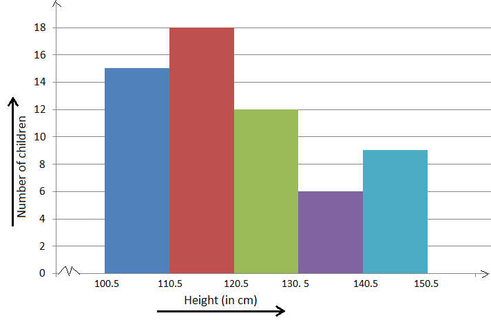
Following the above-mentioned steps, the histogram will be as shown below.
Scale: On the x-axis, 1 cm = height of 10 cm.
On the y-axis, 0.5 cm = frequency 3.
Utility of Histograms
A histogram for a frequency distribution displays the frequencies of different class intervals. As such it becomes easier to locate the class interval having the greatest frequency or the least frequency. Histograms also help to find the mode of a distribution.
Didn't find what you were looking for? Or want to know more information about Math Only Math. Use this Google Search to find what you need.


