5th Grade Data Handling Worksheet
In 5th grade data handling
worksheet, students can practice the questions on bar graph, line graph and pie
chart. We represent the data in many ways. A graph is a pictorial representation
of information. In pictograph the information is presented by using a picture
as symbol. Bar graph is a method of presenting information by drawing
rectangular bars of equal width and with equal space between the bars.
1. Choose
the right answer to show the type of graph that will be used for the following
information.
I. Number
of students in the 5 sections of Grade 5.
(i) Double
Bar graph (ii) Bar Graph
II. Favorite
color of the students of class 5.
(i) Bar
graph (ii) Line Graph
III. The
sale of product of a company in last 6 months.
(i) Pictograph (ii) Line Graph
IV. Marks
obtained by Michael in different objects in 2 terms of the year.
(i) Double
Bar graph (ii) Bar Graph
2. The face
of the clock is like a pie chart with 12 parts. Then:
(i) What is
the angle of each part?
(ii) How many
hours will represent \(\frac{1}{3}\) of the Pie Chart?
3. Given
below is the amount of money withdrawn by Mr Matthew from his bank account in
last 6 months. Tick the most suitable scale to be used for making a Bar Graph.
(i) $ 1,00,000 (ii) $ 70,000 (iii) $ 25,000 (iv) $ 50,000
4. Tick the right Pie Chart for the given information.
Choice of Restaurant
|
Number of Students
|
Mc Donald's (MC)
Pizza Hut (PH) Dominos (Do) Haldiram's
|
15
3 6 10
|
5. Fill in the blanks.
(i) _________ graph is suitable when we need to compare data elements.
(ii) _________ is a collection of numbers gathered to give some meaningful information.
(iii) A __________ represents data through pictures of objects.
(iv) On the scale of 1 unit length = 5 kg, the bar of length 7 units will represent _______ kg.
(v) __________ graphs are used to show change or trend over time.
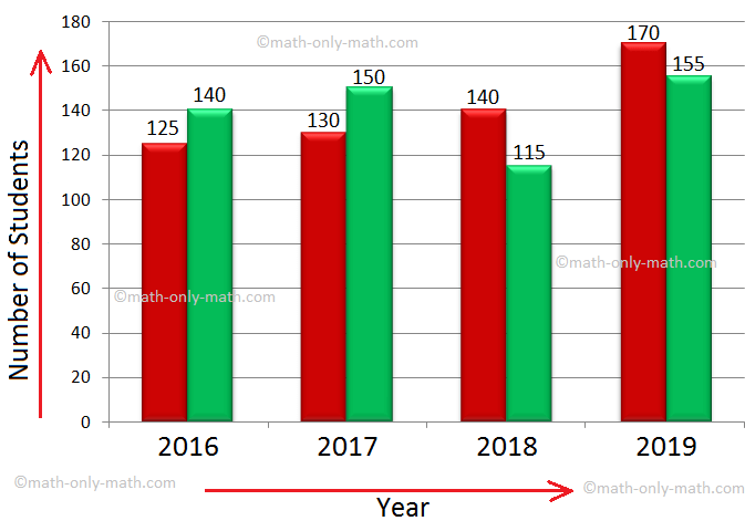
6. Observe the double bar graph given below and answer the questions.
(i) How many students are there in grade 1 in the year 2018?
(ii) What was the least strength of Grade 2 in the given four years?
(iii) What was the difference in the strength of Grade 1 and 2 in the years 2016?
(iv) In which year the difference in the strength of both the grades was maximum?
7. Number of cars sold by a dealer in a week is given below. Draw a line graph for the given data.
8. 48 students were surveyed to find out about their favorite drink. The information collected has been tabulated. Observe the given data and draw a pie chart.
Favourite Drink
|
Number of Students
|
Cold Drink
Fresh Fruit Juice Lemonade Apple Juice
|
6
24 12 6
|
Answer the given questions.
(i) Which is the most favorite drink of the students?
(ii) How many more students like Lemonade than Apple Juice?
(iii) Which is your favorite drink?
Answers
1. I. (ii) Bar Graph
II. (i) Bar graph
III. (ii) Line Graph
IV. (i) Double Bar graph
2. (i) 30
(ii) 4 hours
3. (iii) $ 25,000
4. (ii)
5. (i) Bar
(ii) Data
(iii) Pictograph
(iv) 35
(v) Line
6. (i) 140
(ii) 115
(iii) 15
(iv) 2018
8. (i) Fresh Fruit Juice
(ii) 6
You might like these
In pictographs we learnt to recognize different things in our surroundings and to express the given information through pictorial symbols of different objects.
Concept of pattern will help us to learn the basic number patterns and table patterns. Animals such as all cows, all lions, all dogs and all other animals have dissimilar features. All mangoes have similar features and shapes. Leaves of the same tree have similar pattern of
We have learnt, that a collection of objects can be stored out based on their color, shape, size or any other common thing among them. We can organise all the information in a table to understand how many of each item is there in a collection. Information collected is called
Some sample examples of pictographs or pictorial representation are shown, how the objects are used to give information regarding mathematical data. Read the pictograph and gather the information
We will discuss here how to use Tally marks. To count the number of times a value of the variable appears in a collection of data, we use tally mark ( / ). Thus tally mark represents frequency. Observe the tally marks and the corresponding frequencies:
In math practice worksheet on data handling we will solve numerous types of questions on handling data, frequency distribution and on grouping data. Questions on frequency distribution
In worksheet on pictographs, all grade students can practice the questions on data handling. We can present the given information in many ways. In pictograph the information is presented by using a picture as symbol. A pictograph has a title and a key.
We learn how to represent the data on the bar graph. Data can be represented by bars (like rectangle) whose lengths represent numerical values. One can use horizontal or vertical bars. Instead of rectangles one way even use line segments in such graphs.
In worksheet on bar graph we will practice different questions on representing the bar graph from the following data given in the questions. 1. The number of bed-sheets manufactured by a factory during five consecutive weeks is given below.
Now we will discuss about the construction of bar graphs or column graph. In brief let us recall about, what is bar graph? Bar graph is the simplest way to represent a data. In consists of rectangular bars of equal width. The space between the two consecutive bars must be
In math worksheet on bar graphs students can practice the questions on how to make and read bar graphs or column graphs. Test your knowledge by practicing this graphing worksheet where we will
We will learn how to represent data on a bar graph. We have seen how pictograph represents a pattern of information through numerical data in general. But such representation takes
The pie chart is a pictorial representation of data relative to a whole. Each portion in the circle represent an element of the collected data. The pie chart represents the composition of various elements in a whole. The total value of the pie chart is always 100%.
Bar graphs are used to compare changes between different groups. Line graphs are used to compare two variables. The data which changes over a period of time can be displayed through a line graph. In line graph: ● Points are plotted on the graph related to two variables
Double bar Graph helps us to compare two data groups. For example the graph given below compares the number of boys and girls in classes I – V. Solve examples on Double bar Graph Observe the graph and answer the questions given below. Answer the given questions
5th Grade Math Problems
From 5th Grade Data Handling Worksheet to HOME PAGE
Didn't find what you were looking for? Or want to know more information
about Math Only Math.
Use this Google Search to find what you need.
Share this page:
What’s this?
|
|
New! Comments
Have your say about what you just read! Leave me a comment in the box below. Ask a Question or Answer a Question.